Challenge everyone to become their greatest version
Freeletics offers AI-supported fitness and mindset coaching to help people form healthy habits and reach ambitious goals. It guides users along their self-development journey by putting a digital personal coach in their pocket, providing them with the perfect workout plan, nutritional guidance, educational content and one of the most passionate communities in the world. I’ve joined Freeletics in 2015 when the company was just founded and we’ve been a small team of 25 people. Within less then a year we grew to more than 100 people and the press named us as one of the hottest startups. Thanks to our founders we had a great product with an even better storyline applied by a more than dedicated community. Within four years, I’ve worked in different roles. I’ve started as an R&D Analyst focusing on the sport scientific angle of the product. At this point, User Research was not a well-known job, but we caught it up on conferences when Spotify launched and reported about their positive experience with this kind of activity. that’s when my role shifted towards UX and later on Data Science. No need to mention, that this produced a lot of overly interesting projects, that did not only contribute to the companies success but also my personal growth. I’m proud that I had the chance to be part of their amazing team and seeing the company grow from the beginning. Below I have selected some of the most interesting projects for me personally. Of course, I can’t share insights or methods on a detailed level, but I’m happy to discuss ideas or help to assist scientific study ideas that might come up. Simply use the contact form to approach me. I’m all ears!
Applied Psychology - “Project Knight” (2018)
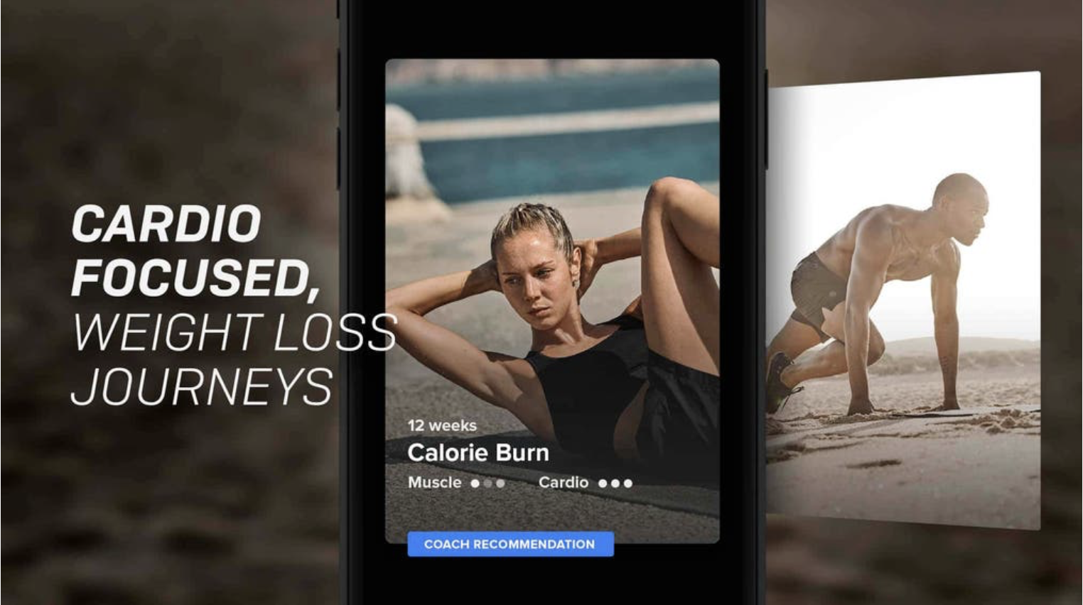
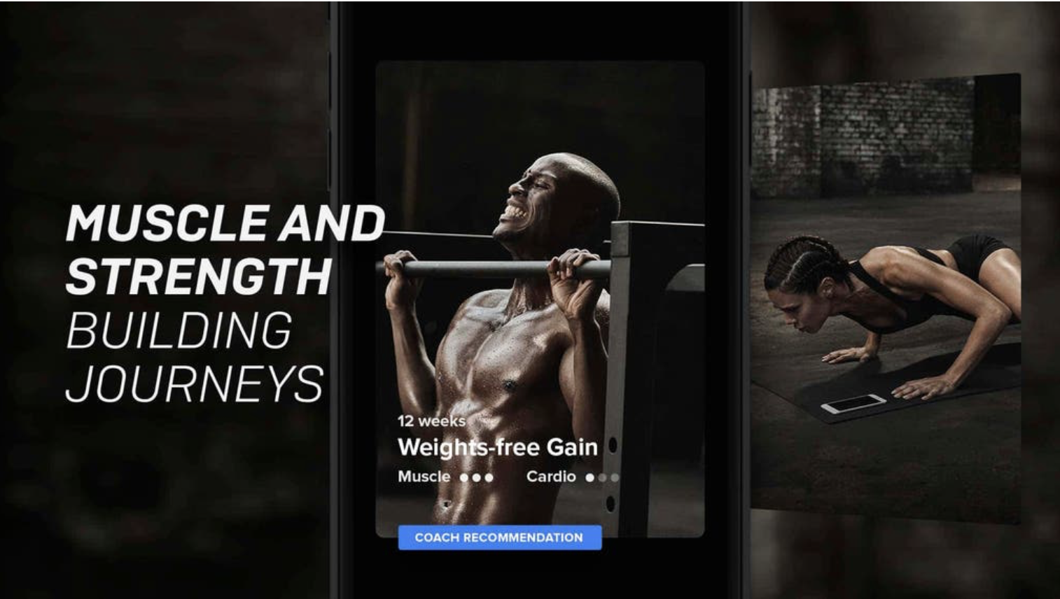
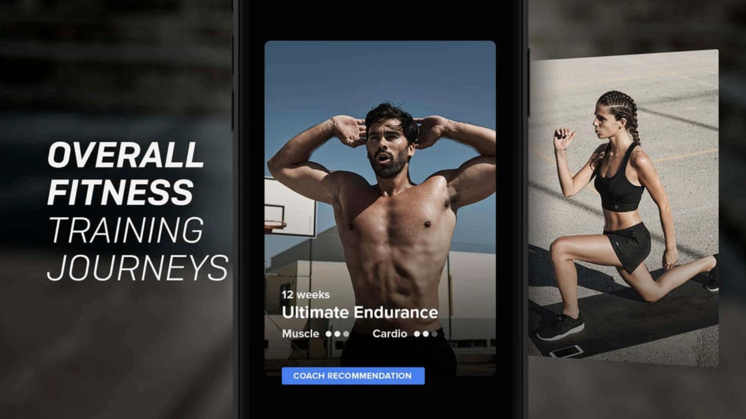
The project was initiated to quantify user motivation to support a massive all-company project with the working title “project knight”. We wanted to get a proper psychological understanding of our athletes’ behavior and motivation to enable them to become their greatest version mentally and physically. Based on established personality models, we selected a scientifically validated questionnaire (with the best trade-off in terms of output, costs, access, and data security) and launched to millions of users. This helped us to gain insight into what holds users back from succeeding, how we can help them to establish healthier habits and how brand perception influences this. In a nutshell, we found out that typical Free Athletes are significantly more disciplined, organized, outgoing, stable, cooperative and they enjoy the competition. Goal-setting, as well as appreciation, are key for them. However, we could identify another type of user who is rather afraid of change, prone to stress, solitary, less dutiful, suspicious and driven by security. Within the framework of this study, we could also link these two types to different product needs, expectation towards a motivational fitness service (e.g. less competition, more explanation, health focus, reminders, friendlier communication) as well as their self-chosen goal in the app. This in return helped setting up the Freeletics Training Journeys, which were launched with a big New Years Campaign in 2018/19.
Surveying - “Churn Prevention and Reactivation” (2018)
Background: Churn is a crucial and natural part of every service cycle. No matter if we want to prevent cancellations or simply provide a respectful goodbye, we need to identify user problems and needs to do so. From a scientific perspective, there’s a variety of reasons why people start or stop doing sports (e.g. variety seeking, society’s expectations, health effort, time until results are visible, etc.). From a business perspective, the early coach weeks are the most important when it comes to retention. As we realized that our athletes are more likely to have dropped out by the end of their second week rather than continue, we wanted to understand why that is and what we can do about it. Even though we had ideas on drop-out reasons from previous research, we lacked information on how certain reasons spread throughout the community. Getting that piece of the puzzle would help key stakeholders to take decisions more effectively and with higher confidence.
Approach: We decided to work with surveying and started with a quick-and-dirty format in its first iteration. In this initial step, we categorized information from previous projects and added an open answer field to make sure we’re not missing something out. With the results of this first round, we adapted the item categories, added the Net Promoter Score as well as a filter question, to help us evaluate the reactivation potential as well as improvement ideas. Ultimately we adapted structure and style, so it had a brand conform look. This helped us to raise click- and completion-rates to reach quality criteria.
Insights: We found out that a vast majority of people quit due to pricing, subscription model issues or because they were unhappy with the coach training experience (no fitness level match, lacking variety, coaching, and progress). Another part reported health issues or unusual life events (exams, pregnancy, moving, etc.). All these results were expected with regards to our pre-defined categories, but this time it helped us understand how big the influence of each category is. The most interesting insight for me personally was the granularity of reasons that we could extract from the open answers field (30 different reasons in 9 categories). This provides a great foundation for design thinking activities in the area of personalization. Furthermore, with regards to Customer Lifetime Value, we could see that smaller categories should be considered for prioritization, too, as they showed the highest CLV values. Product decisions are often made based on what the majority says, but the solution and transfer effects to bigger audiences are often hidden behind the small numbers that get easily ignored. Overall this was a great challenge to balance business needs, UX, scientific standards and resource management.
Personas - “Community Characters” (2016/17)
Building empathy with users makes the innovation- and product development process not only fun but also more effective. To highlight critical moments in the user journey, a long series of interviews was conducted around several topics. We collected information on the group- as well as individual training, how users manage to get back to training after a break (e.g due to the flu or an injury) or how people describe their first impression of Freeletics as well as how the social discovery of the app functions (digital vs. real-life training). From the results, we extracted patterns and linked them to established constructs and previous insights from our database. Here is a sneak peek for you:
Contextual Inquiry, Guerilla and Usability - “Training Experience” (2015/16)
Between 2015 and 2006 we invited users to test several concepts in UI/UX and training. Furthermore, we conducted interviews, card sortings and focus group sessions on multiple product-, training or personality-related topics. As we investigated a fitness service, that pushes users into high heart rate zones we needed to make sure to test our concepts specifically in a real-life context, namely while working out. This was important to consider, as intense physical activity leads to fatigue processes which in return can affect the usability of our interfaces. Designs that might perfectly work under lab-condition (rest) fail in context due to physical exhaustion. Typically we could observe sweaty and shaky hands during and post-workout or people damaging their new-bought phones as they let them drop or stepped on them during their workout. Of course, this made us rethink our design approach. Design Elements were required to become super readable, clickable and reduced to the absolute key information as attention spans and muscle coordination turned out to be poor. But we also started to think about ways to prepare users for their routines in advance as well as provide them with feedback options on their exhaustion level. Clear instructions, for instance, how to handle the phone and equipment during a routine, were key. This was (among others) considered by the Wear/Merge team when designing for the workout mat later on (specific phone area on training mats).
Furthermore, we developed the Intensity Feedback feature based on these insights. This feature goes back to the so-called Borg Scale of Perceived Exertion, a standard tool for scientists, coaches, and even clinicians to quickly estimate a person's current cardiovascular condition. This was one of the first steps to make the product feel like a real coach from a user's perspective, but it also enabled us to provide way better training algorithms that adapt better to the user in the end. With this feature in place, we were furthermore able to explain previous insights better. For instance, we knew from interviews, that users are most likely to recommend Freeletics to a friend when being in what they call a “post-workout-rush” (word of mouth). And in fact, many studies link positive affect to work out intensity. However, this intensity is very specific and hard to meet without proper measures. In the same context, we new from a huge diary study in 2015 with more than 200 participants, that post-training emotions strongly influence a user's pre-training motivation (anticipation). This goes along with the Rubicon Model of action phases (Heckhausen/Gollwitzer). Motivational lacks are mostly caused by the anticipation of negative experiences that happened within passed training. With the Intensity feature in place, we could filter out these specific conditions in and provide users with maximum flow experience to keep up the motivation to reach their transformative goal.


